Why Color Is More Than Decoration
When you walk into a room, color registers before furniture arrangement, before artwork, often before anything else. That immediate impression is partly physiological - different wavelengths of light trigger distinct responses in the eye and brain - and partly the product of learned associations built up over a lifetime. Together, these two forces make wall color one of the most powerful levers in residential design.
Researchers in environmental psychology have documented that color can influence perceived room temperature, the passage of time, and even how loud a space feels. None of these effects are absolute or universal, but they are consistent enough to be genuinely useful when planning a room. Understanding them helps you make deliberate choices rather than guessing.
If you've ever felt inexplicably tense in a room or reluctant to spend time there, color may be a contributing factor - alongside layout, lighting, and acoustics. See our article on signs that a room isn't working for you for a broader diagnostic framework.
90 sec
Time to form a color-based impression of a space
Research in color psychology suggests people form initial judgments about an environment within 90 seconds, with color accounting for a large share of that impression.
~3°F
Perceived temperature difference between warm and cool rooms
Studies in environmental psychology have found that people in rooms painted with warm hues estimate the temperature as several degrees warmer than those in identically tempered cool-hued rooms.
62-90%
Share of color assessment attributed to hue alone
Color researcher Frank Mahnke and others have noted that hue is the dominant variable in color assessment, though saturation and value also contribute meaningfully to perception.
The Core Hue Families and Their Associations
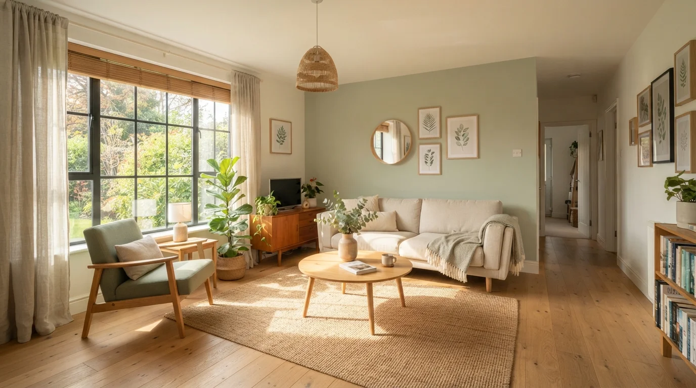
Blues and greens are broadly classified as cool hues. In residential contexts, they are most consistently associated with calm, reduced anxiety, and mental clarity. Lower saturation versions - think dusty teal, sage, slate blue - tend to feel restful without reading as cold. These hues are popular in bedrooms and bathrooms for this reason.
Reds, oranges, and yellows sit on the warm end of the spectrum. They register as stimulating and energizing, and in high saturation they can raise perceived room temperature by a few degrees - a well-documented perceptual effect. Warm hues work well in spaces meant for social activity, such as dining rooms and kitchens, but can be counterproductive in rooms designed for rest or focused work.
Neutrals - whites, grays, beiges, and greiges - provide a flexible foundation. Their psychological effect is largely determined by undertone: a warm beige reads very differently from a cool gray, even at the same lightness level. Many designers use neutrals as a backdrop precisely because they allow furniture and textiles to anchor the room's emotional tone.
Saturation and Value: The Variables Most People Overlook
Hue is only one dimension of color. Saturation (also called chroma) describes the intensity or purity of a color - how much gray is mixed in. A highly saturated red is vivid and assertive; a desaturated version of the same red becomes a dusty rose that reads as soft and approachable. The psychological effect of these two colors is dramatically different despite sharing the same hue.
Value refers to lightness or darkness. High-value (light) colors tend to make spaces feel open and airy. Low-value (dark) colors create enclosure, intimacy, and drama. Neither is inherently better; the question is what atmosphere serves the room's purpose.
Because saturation and value interact with your room's specific lighting conditions, a paint chip on a card is a limited preview. How natural light behaves in your home shapes the final appearance of every color you choose. Test large painted samples - at least 12 inches square - on the actual wall and observe them at multiple times of day before committing.
The finish of the paint also matters. A flat finish absorbs light and minimizes imperfections; a satin or semi-gloss finish reflects it, which changes how saturated a color appears. Our guide to paint sheens explains what each level means in practical terms.
Test Before You Commit
Never rely solely on a paint chip to choose a wall color. Paint a 12-by-12-inch or larger sample patch directly on your wall and observe it in morning light, midday light, and under your evening artificial lighting. Colors shift substantially across different light sources, and what looks perfect at noon may read entirely differently after dark.
Applying Color Psychology Room by Room
Bedrooms benefit from colors that ease the transition into rest. Low-saturation blues, greens, and warm neutrals are reliable starting points. Avoid very high-saturation or highly stimulating hues on all four walls, though an accent application can work without overwhelming the space.
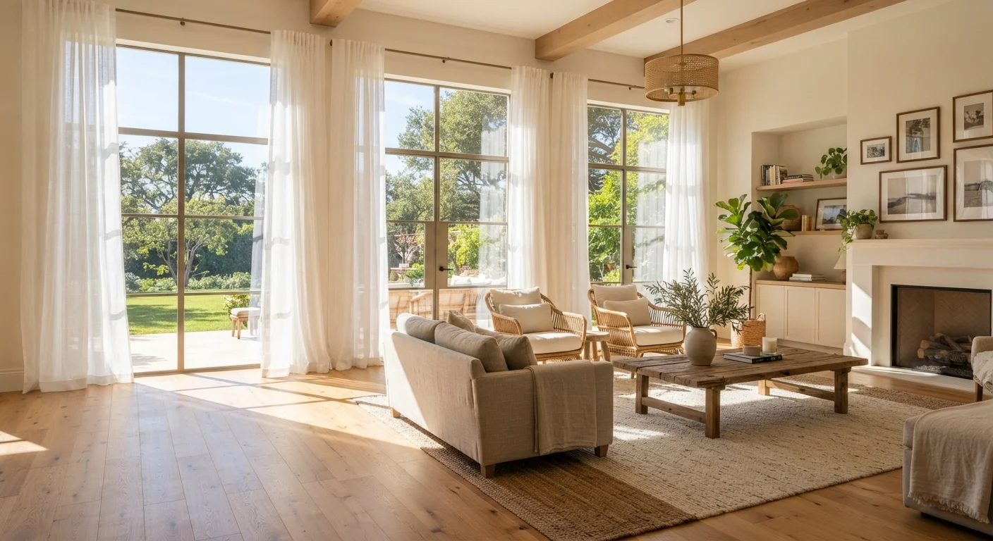
Living rooms need to serve multiple functions - relaxation, socializing, and sometimes work. A medium-value neutral with warm undertones creates a flexible backdrop. If you want more character, consider one wall in a richer hue rather than painting the entire room.
Kitchens and dining areas are spaces where moderate warmth can be an asset. Soft yellows, warm whites, and earthy tones tend to read as inviting. If your kitchen receives strong natural light, you have more latitude with saturation.
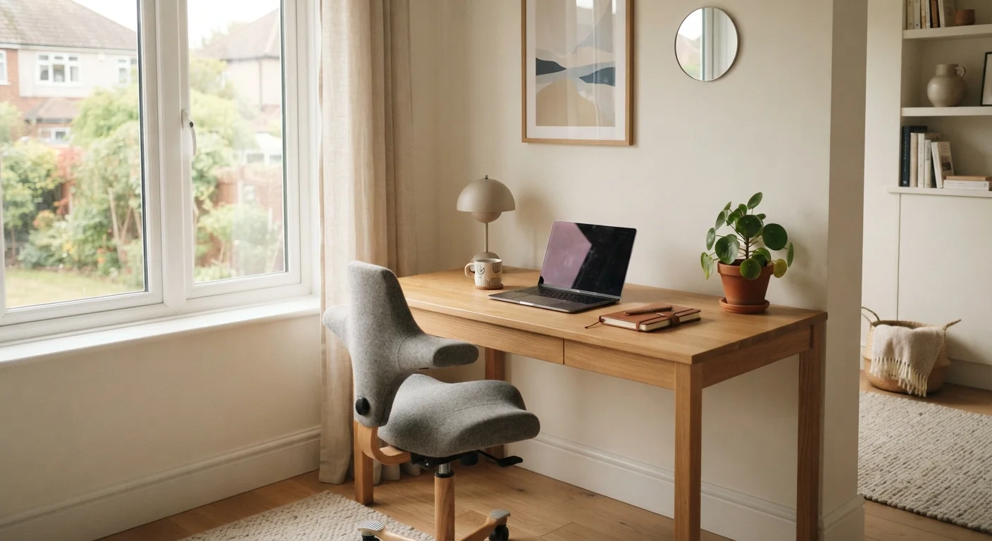
Home offices generally benefit from colors that support sustained attention without becoming fatiguing. Muted greens and soft blues are frequently cited in design literature for this role. For a more complete look at what makes a workspace functional, see our article on setting up a home office that supports focus and wellbeing.
Color choices also interact with how spaces connect to each other. A palette that clashes between adjacent rooms disrupts the sense of visual continuity that designers call flow. For more on how rooms relate, see what interior designers mean by flow.
“Color is a power which directly influences the soul. It is the keyboard, the eyes are the hammers, and the soul is the piano with many strings.”
— Wassily Kandinsky, Painter and influential theorist of color and form