Start with Neutrals as Your Foundation
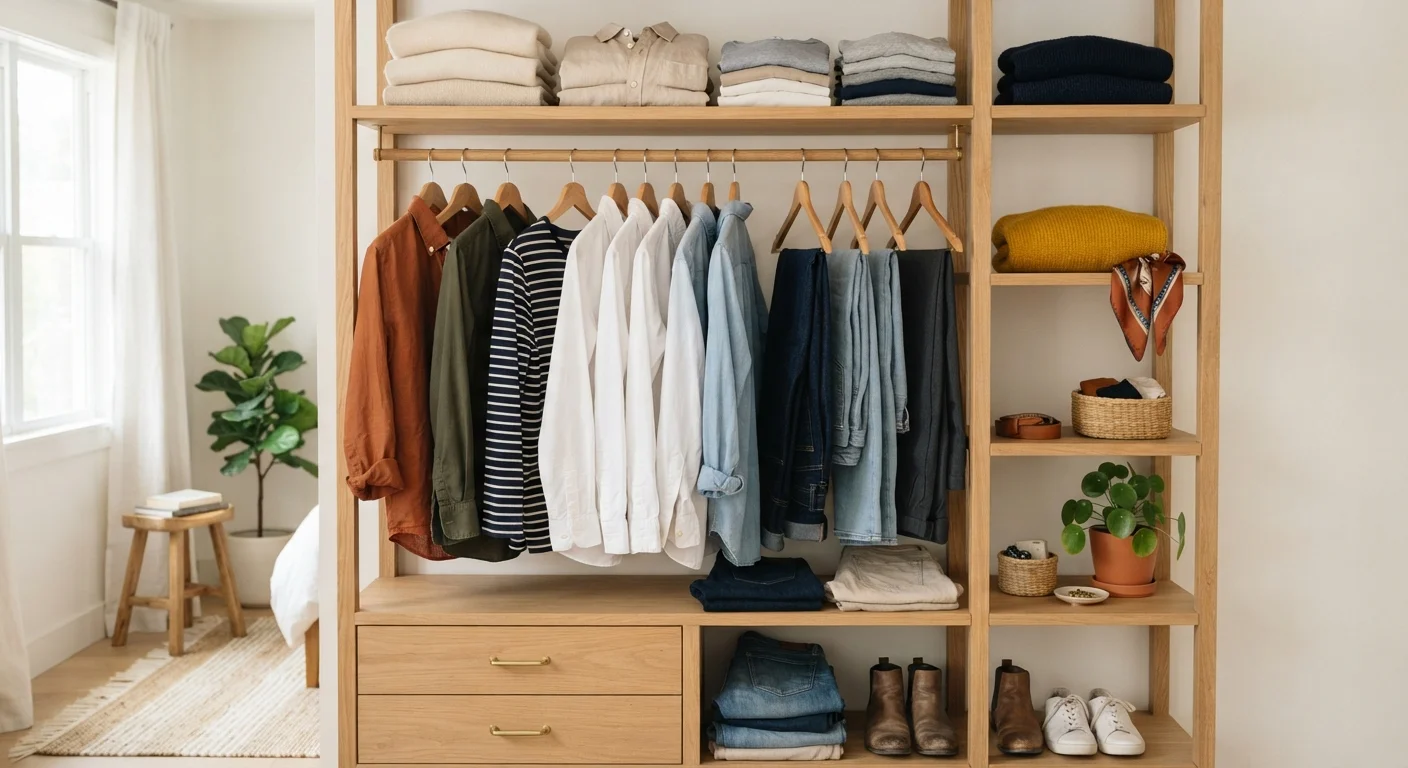
Neutrals are the workhorse of any wardrobe. Black, white, gray, navy, camel, and cream exist on a visual frequency that harmonizes with almost everything else, which is precisely why they show up in the foundations of a versatile wardrobe. When you anchor an outfit in a neutral — a white tee, a camel coat, charcoal trousers — you create a visual resting place that lets any bolder piece breathe without overwhelming the eye.
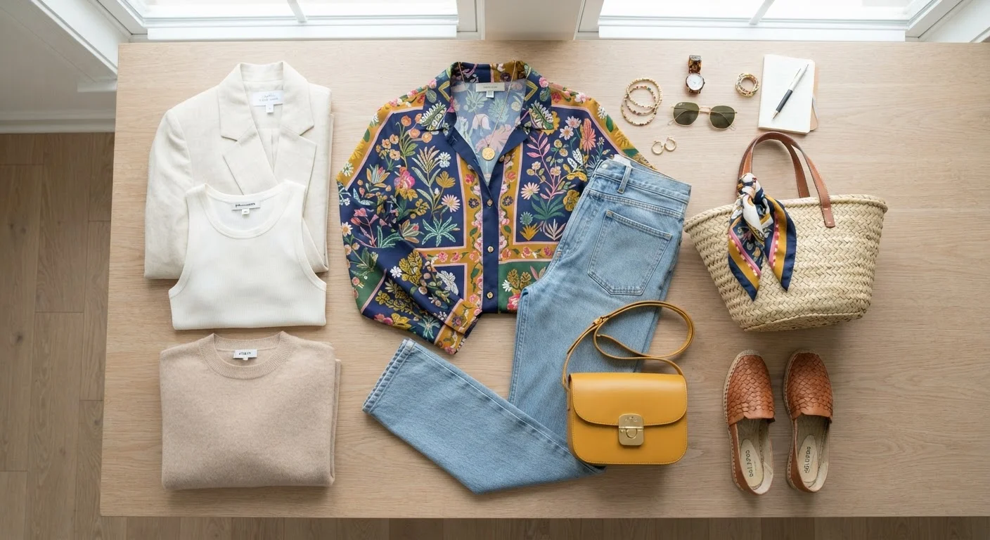
Think of neutrals less as boring defaults and more as volume controls. A vivid printed skirt paired with a white top keeps the print as the focal point. The same skirt over a printed blouse creates competition for attention. One neutral in the mix lets your statement piece do the talking.
The One-Focal-Point Rule
When building any outfit, try to identify a single focal point — a bold color, a standout print, or a statement silhouette — and let neutrals or quieter pieces support it. This simple edit prevents visual overload and makes even complex combinations look polished.
A useful shorthand: if you're ever unsure whether an outfit works, reduce the number of competing focal points to one. Neutralize everything else and build outward from there.
How Color Works in an Outfit
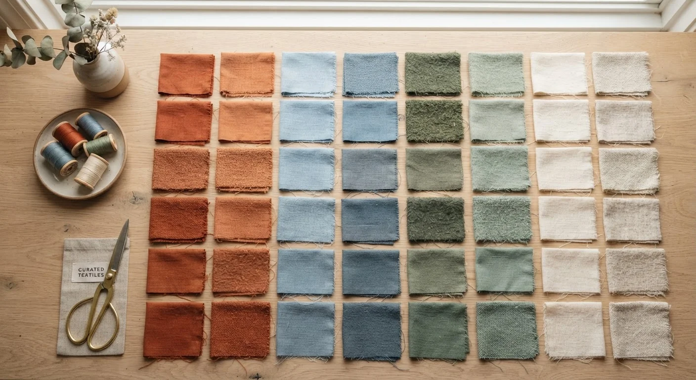
You don't need to memorize a color wheel to dress well, but a few principles from color theory translate directly into everyday styling. Analogous colors — hues that sit next to each other, like rust, terracotta, and gold — feel warm and naturally cohesive. Complementary colors — opposites on the wheel, like blue and orange or green and red — create high contrast that reads as bold and intentional when used with confidence.
Tonal dressing is one of the easiest approaches: choose varying shades of the same hue and layer them. Ivory, oat, and camel together feel effortlessly sophisticated. The slight differences in shade create visual interest while remaining deeply harmonious. For more on how your color choices communicate mood and identity, see our piece on building a personal color palette.
62%
Adults who feel more confident in coordinated outfits
A survey by the American Psychological Association found that clothing choices meaningfully influence self-perception and how others perceive us, though individual results vary widely.
3:1
Neutral-to-statement ratio many stylists recommend
Many professional image consultants suggest roughly three neutral or tonal pieces for every one bold color or statement print as a starting guide for outfit balance.
Mixing Patterns Without Chaos
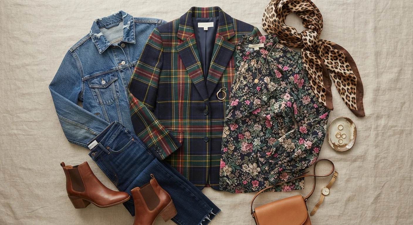
Pattern mixing trips people up more than almost anything else in styling — but it follows clear, learnable rules. The most important: vary the scale. A large-scale floral and a small-scale stripe can coexist because they occupy different visual territories. Two prints of identical scale compete for dominance and tend to look accidental rather than intentional.
The second rule: find a shared color. If both patterns contain even a hint of the same hue, the eye reads them as related. A navy-and-white stripe with a navy-accented paisley feels coordinated even though the prints are completely different. For a deeper dive into the visual logic behind bold combinations, our guide on mixing patterns and textures walks through the principles with concrete examples.
A practical starting point: let one pattern lead (usually the larger or bolder one) and treat the second as a supporting player in a smaller proportion — a patterned scarf, sock, or cuff rather than a full patterned piece.
Pulling It Together: Outfit-Level Thinking
Individual pieces matter less than how they interact. Styling is fundamentally a relationship between elements — color, scale, texture, and proportion all play off each other. A few habits help develop that instinct quickly.
Pull a color from your print. If your top has a floral with hints of sage green, echo that sage in your trousers or shoes. This "color echo" technique is one of the most reliable tricks for making an outfit look considered rather than coincidental.
Limit bold focal points to one or two. An outfit with a statement print, a bright color, and a sculptural silhouette all at once asks a lot of the viewer's eye. Dial back two of those elements and the third shines. This is explored further in our article on the building blocks of a signature look.
Use texture as a quiet variable. When you're working in a tonal or neutral palette, texture — linen versus silk versus cable knit — adds depth without introducing additional color complexity. It's an underrated tool for elevating simple combinations.
For ready-made combinations that apply these principles across different occasions, the outfit formulas worth knowing is a useful companion.
“Getting dressed is a form of self-expression. Understanding a few visual principles doesn't constrain that expression — it gives it a stronger foundation to build from.”
— Tim Gunn, Fashion educator and author