Why Color Is the First Thing People Notice
Before someone reads your body language or hears your voice, they register the colors you're wearing. Color is processed in the brain almost instantaneously, which means your palette is doing communicative work the moment you walk into a room. It can signal warmth, confidence, creativity, seriousness — or all of the above, depending on how you mix.
This isn't just folk wisdom. Color psychology, a field studied across design, marketing, and behavioral science, explores how hues influence mood and perception. While sweeping generalizations oversimplify the science, patterns do emerge: deeply saturated colors often read as bold and energetic, while muted, desaturated tones tend to feel calm and sophisticated. Brightness matters too — light values feel airy and open, dark values feel grounded and authoritative.
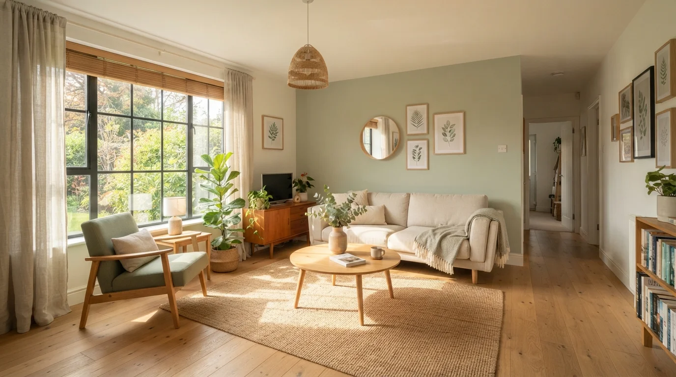
The nuance is that color meaning is deeply shaped by culture, context, and individual experience. White signals purity in many Western traditions but mourning in some Asian cultures. Red can mean power, passion, or danger depending on who's looking. Your personal palette will always be interpreted through the lens of whoever's reading it — so wearing colors that feel right to you is the most authentic strategy. For a broader look at how color shapes perception beyond clothing, see how wall colors affect mood and perception — many of the same principles apply.
90 seconds
Time for initial color-based impression
Research cited in color psychology literature suggests people form initial impressions within 90 seconds of seeing someone, with color accounting for a significant portion of that judgment.
62–90%
Percentage of first impression attributed to color
A widely referenced figure in color research suggests color influences between 62% and 90% of an initial product or person assessment, though exact figures vary by study and context.
33%
Consumers cite color as top purchase reason
Studies on consumer behavior, including research published by the Pantone Color Institute, suggest roughly a third of consumers cite color as the primary reason they choose a clothing item.
Building a Palette That Feels Like You
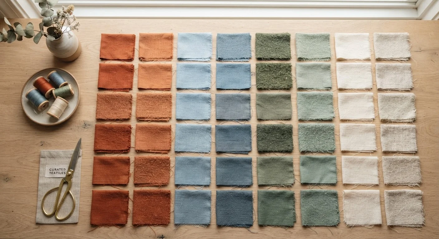
Identifying your personal color palette starts with observation, not a quiz. Pull every piece of clothing you actually love wearing and lay it out. Patterns will almost always emerge — maybe you reach for olive greens and warm browns constantly, or maybe your favorite pieces are all in cool, dusty tones. Those instincts are data.
From there, you can refine with two useful lenses:
- What harmonizes with your natural coloring. Skin tone, hair color, and eye color all interact with fabric colors. Warm undertones in skin often harmonize with earthy, golden hues; cool undertones typically complement blues, purples, and rose tones. But this is a guide, not a law.
- What you feel like yourself in. If a color energizes you when you put it on, that's a meaningful signal. Confidence is its own kind of attractiveness, and no shade creates it like wearing something you genuinely love.
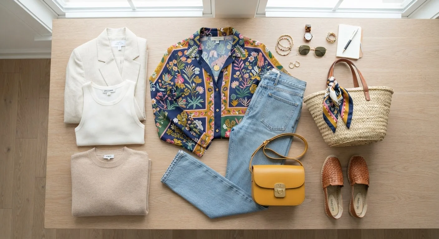
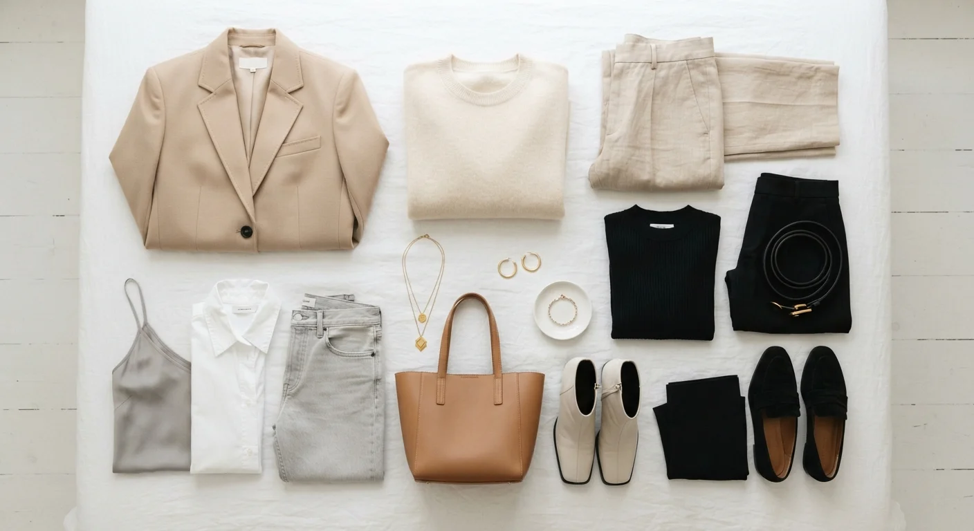
Aim to anchor your palette with two or three reliable neutrals — think navy, cream, camel, or charcoal — and then build around two to four accent colors you find genuinely exciting. This structure keeps your wardrobe cohesive and makes getting dressed significantly easier. The guide to mixing neutrals, patterns, and color breaks down exactly how to make these combinations work in practice.
Start With What's Already in Your Closet
Before buying anything new, spend 20 minutes pulling out your most-worn pieces and grouping them by color family. The clusters that emerge are your instinctive palette — and a reliable starting point. You may discover you already have a signature color story without having named it yet.
How Color Fits Into Your Broader Personal Style
Color doesn't exist in isolation — it works alongside silhouette, texture, proportion, and fit to create a full visual statement. A structured blazer in a bold cobalt sends a different message than the same cut in blush, even though the silhouette is identical. That interplay is worth being intentional about.
Think of your palette as a foundation layer of your style identity. Once you've identified it, it becomes easier to shop with purpose, build outfits that feel cohesive, and recognize quickly when something on a rack simply isn't for you — saving time and money in the process. For a fuller picture of how color works alongside other style elements, explore the building blocks of a signature look.
It's also worth noting that your palette will shift. The colors you loved at 25 may feel different at 40 — and that's not inconsistency, it's growth. Personal aesthetics naturally evolve over a lifetime, and your palette should be free to grow with you. The goal is never rigid adherence to a formula — it's self-expression that feels current and alive. For a comprehensive view of how all these elements come together, this full guide to personal style is a great next read.